
O365 Visual Language Redesign
C o n t e x t
O365 has 345 million paying users, with a 17% yearly increase in commercial revenue.
Enterprise Social Apps alone have 270 million users, with 20+ related apps and growing.

P r o b l e m
O365’s design language across various apps is disjointed with several generations of visual styles.
G o a l s
Create a cohesive visual language across different Microsoft O365 organizations.
Proactively invest in a broad library of UI illustrations, icons, and components.
T e a m
10 Designers: 2 on icon & emoji; 3 on illustrations; 5 on UI components.
No PMs were staffed, as this was a self-organized effort
2 UI engineers, as well as front-end engineers across orgs
So what options did we consider?

Human
Our brand is alive with emotion. It lives and breathes and draws you in— creating a sense of closeness and connection.
Dimensional
Our brand is rich and layered. We illuminate hope and potential with depth and perspective — inspiring inventive new ways of looking at the world.
Vibrant
Our brand is active and impactful. We radiate positivity— sparking a feeling of passion, purpose & momentum.


Unmistakably Microsoft
You want to recognize what you are looking for. Illustrations should feel like one Microsoft. One moment, one product, one experience at a time. We focus our energy on elements that connect our products together and give them a distinctively Microsoft feel — creating a system of shared illustrations across M365.

One for all, all for one
Our customers want to feel included. To better align with our inclusive design values, we limit people-centric metaphors and opt for more universal symbols.

Crafted from the UI
The illustration and copy naturally blend into the interface, making the interaction more tangible and connected to Fluent’s design language.
Copy embodies the minimalist look and feel by being as lightweight (but impactful) as possible.

Dark Mode
Dark mode is a game of balance. Color is crafted by light and balances between self-illuminance and maintained meaning. Neutral grays give harmony while pure black conveys a distinctive dark appeal.
Motion implies metaphor
Compositions are dynamic and are designed with motion to assign meaning. They are playful and inspire action.

Copy brings focus
Copy is just as important as image. Direct, concrete copy closes the gap between abstract, visual metaphors and context while establishing clarity for what the user needs to know and do. Copy also reflects Microsoft’s core copy principles of warm and relaxed, crisp and clear, and ready to lend a hand.

Monoline Fluent Icons
App navigation / wayfinding .
Reactions and Emojis
Personal expression across M365.
Wallpaper
Wallpapers were created for specific groups and use cases.

Small 3D spot illustrations
Describe app features at small scale. They visually break between 2D and 3D by “popping out” of a circular color background
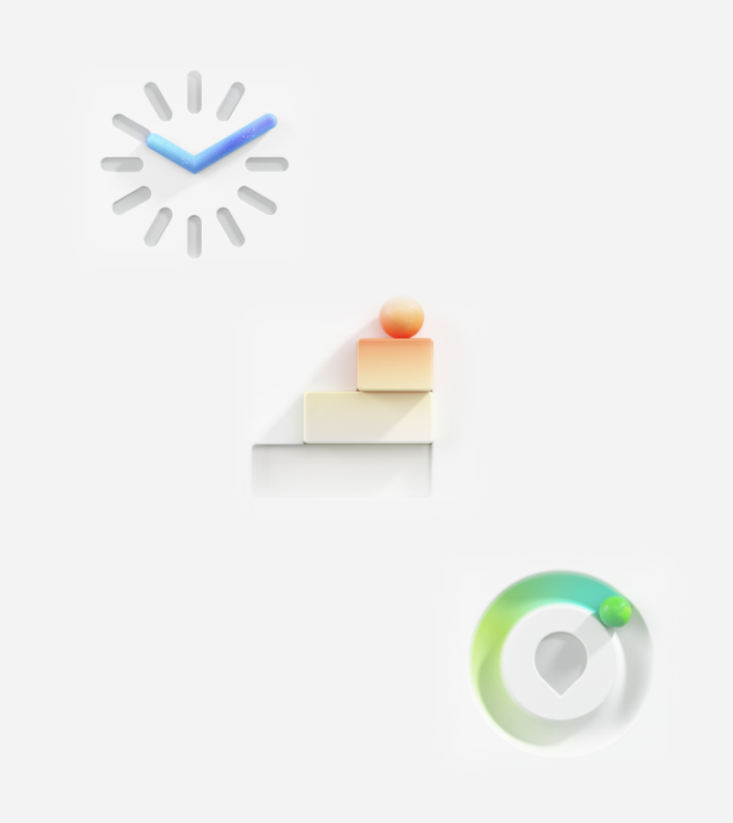
Medium 3D spot illustrations
M365 system-wide illustrations (such as empty & error states) that fit into the UI. They naturally blend into the canvas and are inspired by the (M365) brand color palette
Fully immersive 3D illustrations
Fill the UI screen. Color palette is inspired by the product personality .